


As well as offering designers a variety of new creative platforms, digital media is making us rethink the fundamentals of design. We know the rules: a solid brand identity entails a logo, with hard and fast rules governing its treatment and these are never altered. Ever. Or at least that was the case.
Creatives are now designing for websites, apps and a multitude of other digital displays where no two screen sizes (or even screen shapes) are the same. A solution to this problem is responsive design, which adapts a layout to fit different displays and resolutions. Along with this new type of design comes a key element in modern branding – the responsive logo.
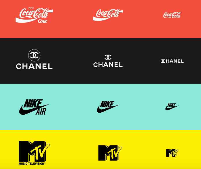
A responsive logo is a simplified version of the original where superfluous detail is removed and only the essence remains. The smaller the screen, the less space for detail and the simpler the logo becomes. While this new approach to logo design may take some getting used to, it is not to be ignored in today’s design environment – rather have an easily identifiable responsive logo than a one-size-fits-all approach where the logo is so tiny and detailed that it compromises brand recognition. After all, we identify brands based on a number of elements such as the logo type and logo mark, so why not also by responsive versions of the logo itself?
A project by Joe Harrison illustrates how responsive logos should work. Harrison experimented with well-know brands, simplifying them as they scaled down to fit the smallest of screens.
Note: Harrison’s designs are not affiliated with the brands they depict.
Image source: http://responsivelogos.co.uk.